- Kia Logo
- Kia: Brand overview
- Meaning and History
- 1953 – 1964
- 1964 – 1986
- 1986 – 1994
- 1994 – 2012
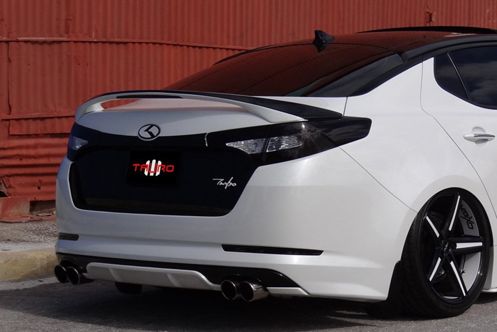
- 2012 – 2021
- 2021 – today
- Font and Colors
- Kia color codes
- Why does Kia have different logos?
- What does the Kia logo stand for?
- Does Kia have two logos?
- Эмблемы эмблемы Киа послепродажного обслуживания
- Эмблема логотипа Kia 3D K
- Эмблема Kia K из углеродного волокна черного цвета
- Kia Logo – K Badge КРАСНЫЙ
- Kia Logo – K Эмблема СИНИЙ
- Kia K Logo White
- Размеры логотипа Kia
- Установка логотипа Kia
- Kia K logo Происхождение
Kia Logo
The smoothness of movement and the harmonious combination of “stuffing” and external design are reflected in the company logo. “Vehicles that come off our assembly line are able to overcome any bends in the road” says the Kia logo to customers.
Kia: Brand overview
| Founded: | June 9, 1944 |
| Founder: | Hyundai Motor Group |
| Headquarters: | Seoul, South Korea |
| Website: | kia.com |
The South Korean brand Kia hasn’t always been automotive. Its creator, Kim Chul Ho, started by making nuts. A few years later, in 1944, he founded a bicycle parts company. The production of metal pipes has become an important part of the business. In 1952, the company presented its first bicycle, and a year later, it received a new name: Kia Industries. In 1960, the plant produced the truck under the Mazda license. As for the first line of Kia Brisa passenger cars, it appeared much later – in 1974.
Meaning and History
The modern brand name is simple but full of meaning. It was created based on two hieroglyphs: “ki” (indicates upward movement, the beginning of a continuous action) and “a” (house, Asia). In one of the meanings, it can be deciphered as “native of Asia.”
Before the company saw the automotive industry’s potential, it used many different logos that varied in color and design. Significant changes to the identity came in 1994 when Kia acquired the famous lettering symbol inside the oval. Over time, it was modified and then disappeared altogether, giving way to a minimalistic and abstract word sign.
What is Kia?
Kia is a South Korean corporation that ranks second in size among all automakers in its country. It was established in 1944 and initially produced only bicycle parts. Then its assortment was replenished with motorcycles, trucks, and cars. Kia’s current parent company is Hyundai Motor Group.
1953 – 1964
In 1953, Kyungsung Precision Industry became Kia Industries. This almost did not affect its range: it continued to produce bicycle parts and only four years later switched to Honda’s motorcycles production. But the rebranding was reflected in the logo. It contained a complex geometric composition that consisted of many polygons, including squares, rectangles, triangles, and diamond shapes. The centerpiece – a circle with rectangular jaggies – looked like a cogwheel. Inside it was the word “KIA.”
1964 – 1986
In 1964, the inscription disappeared, and the emblem acquired a simplified form. It was a green circle with an angled ledge at the top right, like an inverted Q. It resembled the stylized “K” badge that was used on vehicles sold only in South Korea.
1986 – 1994
In 1986 the firm returned to the automotive industry. This happened after a forced hiatus because the dictator Chun Doo-hwan banned passenger car production in 1981. The first car of the new era was the Kia Pride, commissioned by Ford and Mazda. The Kia Motors enterprise was little-known and was considered cheap labor, but received the right to export Pride under its brand. However, due to the contractor’s status, the company used a logo representing it as a steel pipe factory. The inscription was stylized as a factory: the letter “K” was shaped like a chimney, and above the “ia,” there was a wavy blue line in the form of puffs of smoke.
1994 – 2012
In 1994, the company expanded its lineup with the Sportage SUV and the Mentor family car. The emblem with the factory’s image appeared briefly in the center of the red oval, but then it was replaced by the inscription “KIA.” Notably, the “A” lacked a crossbar, so the letter looked like an unfinished delta symbol. On cars, the word and frame around the oval were chrome, and the interior was burgundy. The white background was used in documents and promotional materials, and the company name and outline were red.
2012 – 2021
After Hyundai saved Kia from bankruptcy, the logo changed slightly again. The badge on the Sorento 4×4 and Picanto vehicles has acquired a dark gray background. The official emblem remains the same as before, but the red color has become noticeably brighter.
2021 – today
In anticipation of the flagship electric vehicle due in 2021, the company has adopted a German agency’s new logo. This became known back in late 2019, when Kia patented the symbol in the form of the connected letters “K,” “I,” and “A.” A similarly styled badge was previously featured on the Imagined concept car in Spring 2019.
The logo’s official presentation took place in January 2021 in the sky over the city of Incheon. The company held a grand celebration on this occasion and set a new world record by using the maximum number of drones in a pyrotechnic show, which simultaneously released fireworks. Many lights formed into the inscription “KIA” and then into the new motto, “Movement that inspires.”
Font and Colors
The latest symbol change is timed to coincide with the adoption of the Plan S business strategy. Its essence lies in the fact that Kia is gradually switching to the production of electric vehicles. Therefore, the brand’s emblem looks ambitious and modern: upward lines represent growth, and symmetry shows decisiveness. A wordmark has a specific rhythm: it looks like a heart rate graph or a wave, which corresponds to the idea of movement.
The company’s name is stylized as a hand-written signature, for which the designers used the font of their design. All three letters are connected, with most of the lines running in parallel. “A” is in italics. She, as before, has no crossbar. New typography makes the lettering resemble the iconic NASA worm of the 1980s. But Kia has an emphasis on sharp angles and no curves, unlike the old NASA logo.
After the redesign, the traditional red color changed to black. According to the documents, on a dark background, the word “KIA” maybe white. A simple palette is another manifestation of minimalism along with a two-dimensional form.
Kia color codes
| Rich Black | Hex color: | #05141f |
|---|---|---|
| RGB: | 5 20 31 | |
| CMYK: | 84 35 0 88 | |
| Pantone: | PMS Black 6 C |
Why does Kia have different logos?
Kia uses two different logos because one is for international use and the other is for domestic use only. The international version contains a stylized brand name written with all letters connected. The South Korean version includes an inverted tick representing the letter K.
What does the Kia logo stand for?
The logo of the South Korean car brand contains only its name, stylized as KIΛ. This word comes from two hieroglyphs that mean “arise” and “Asia.” That is, it indicates the place of origin of the company.
Does Kia have two logos?
Yes, Kia does have two logos. One of them represents the corporation at the international level, and the second is used only for those models sold in South Korea.
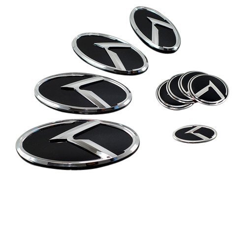
Эмблемы эмблемы Киа послепродажного обслуживания
Вы ищете уникальный логотип KIA на вашем автомобиле? Проверьте список Топ 5 логотипов Kia K.
Разбитый логотип K Kia используется на азиатском рынке и также известен как логотип Kia 3D K.
Эти значки Kia K подходят для автомобилей Kia, таких как Kia Optima, Sorento, Cadenza, Forte, Sportage, Sorento и других моделей. Используйте набор эмблем Kia K на вторичном рынке, чтобы заменить скучный значок «KIA» на руле, передней части, задней части багажника и даже колесах.
Эмблема логотипа Kia 3D K
Проверить цену : эмблема Kia 3D Logo
Измените внешний вид вашего Kia с этой эмблемой 3D K. Это один из самых популярных дизайнов Kia K, который владельцы Kia используют для замены стандартного значка Kia.
Как минимум, вы должны получить набор из 3 предметов, чтобы вы могли поменять значок спереди, багажника и рулевого колеса. Если вы также хотите поменять эмблемы Kia на колесах, ознакомьтесь со списком Amazon, в котором есть все 7 элементов.
Эмблема Kia K из углеродного волокна черного цвета
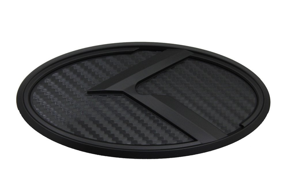
Проверить цену: эмблема Kia из углеродного волокна
Посмотрите на углеродную черную версию логотипа Kia 3D K. Вы можете легко заменить рулевое колесо, передние, задние и колесные значки Kia на Soul, Optima, Forte, Sedona.
Просто убедитесь, что вы заказываете правильные страницы для вашей конкретной модели Kia.
Kia Logo – K Badge КРАСНЫЙ
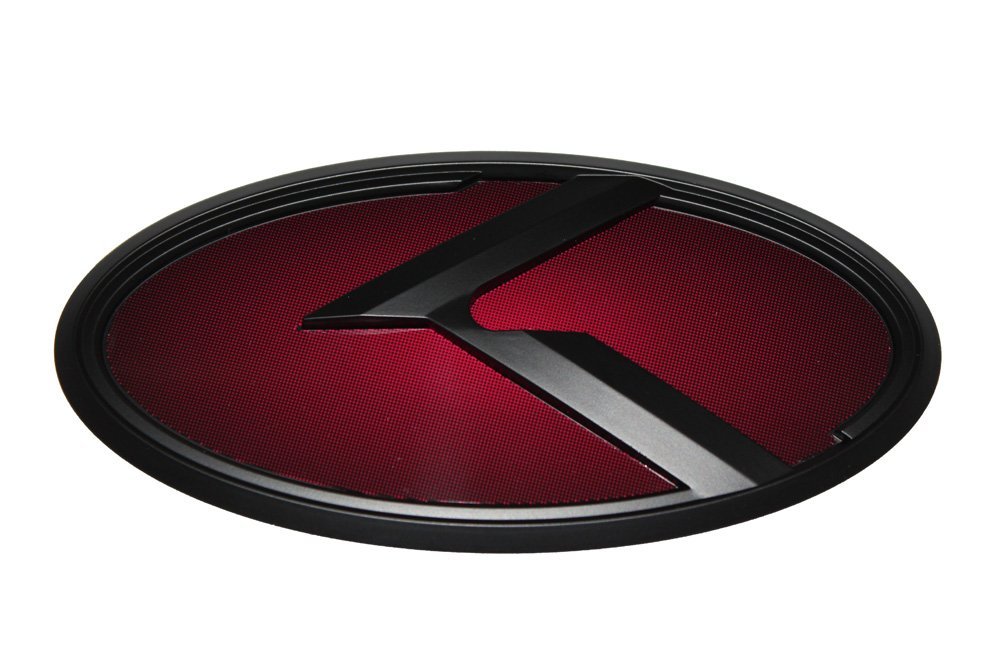
Проверить цену: логотип Kia Red
логотип Kia K в красном. Будет выглядеть круто на черном, белом или красном Kia. Можно использовать для замены переднего гриля, багажника и руля на значок Kia.
Kia Logo – K Эмблема СИНИЙ
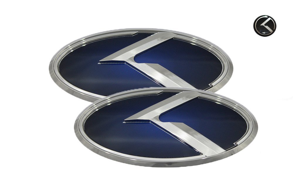
Проверить цену: эмблема Kia Blue
Вы также можете получить логотип Kia K в синем цвете. Отличный выбор, если вы любите синий цвет. Его можно установить на синий или белый автомобиль Kia или даже на черный.
Это все еще 3D K логотип. Вы можете выбрать между хромом или черным ломаным цветом К. Синий логотип K также поставляется с карбоновым волокном и черной отделкой, если вам это нравится.
Kia K Logo White
Проверить цену : логотип Kia Broken K
Последний дизайн сломанного логотипа K с белым фоном. Определенно стоит подумать, есть ли у вас белый или черный автомобиль.
Белый может хорошо смотреться на других цветах автомобиля Kia. Используйте эту эмблему Kia для замены передних, задних значков Kia. Прост в установке.
Размеры логотипа Kia
- Передняя часть: 110мм х 56мм
- Сзади: 129мм х 65мм
- Мини-стикер: 18 мм
- Колпачок центра колеса: 18 мм
* Эти размеры могут варьироваться в зависимости от моделей Optima, Forte, Sedona, Sorento, Rio и других моделей Kia. Проверьте комплектацию, прежде чем купить набор логотипов Kia.
Установка логотипа Kia
Установить новые значки Kia K очень просто. Каждая наклейка идет с лентой 3M на спине. Обратите особое внимание на то, чтобы вы не устанавливали эмблему вверх ногами.
Передний капот и значки багажника удерживаются на месте с помощью клея. Небольшое нагревание значков с помощью электрической тепловой пушки облегчит удаление значка Kia.
Обязательно держите тепловую пушку в самом низком положении, иначе вы можете повредить краску автомобиля.
Используйте средство для удаления остатков, чтобы удалить остатки клея. Goo Gone Cleaner работает очень хорошо.
Чтобы установить значок Kia K на рулевом колесе, вам необходимо снять стандартный значок Kia. Используйте плоскую отвертку, чтобы оторвать значок OEM Kia от рулевого колеса. После удаления старого значка Kia новый логотип Kia K можно легко установить.
Не мойте Kia в течение как минимум одного дня после установки эмблемы и не допускайте попадания воды или дождя на эмблемы.
Kia K logo Происхождение
Kia можно определить как «восхождение из Азии. Kia использует два дизайна логотипа. Текстовая версия используется для маркировки в США и за рубежом, а сломанный логотип K используется в Южной Корее. Если вы хотите узнать больше о значке Kia, прочитайте эта статья: За значком: корейский логотип Kia намного круче.
значок kia optima k
значок kia broken k
значки kia forte k
значок kia soul k
Kia Sportage K-Badge
Значок KIA 3.0 k
Киа Соренто К значки
Значок KIA RIO K
2014 значки KIA Optima K
kia k logo cadenza
логотипы KIA K
логотип kia k ebay
Киа 3.Эмблемы 0 k с логотипом
эмблемы kia 3d k logo
эмблема kia k на 2013 год optima
KIA K эмблема Форте
логотип kia k для sorento
kia k logo forte
логотип kia k на продажу
K знак для KIA
Знак Киа Форте К
Значок KIA FORTE KOOP K
KIA K эмблема Малайзия
логотип kia k происхождение
KIA K эмблема Оптима
kia k logo optima
Значок KIA Optima K 2014 года
KIA K эмблема Филиппины
эмблема руля kia k
логотип kia k sportage
KIA K эмблема Соренто